matplotlib.pyplot
Jump to navigation
Jump to search
A matplotlib.pyplot is a plotting library within matplotlib.
- See: Scatter Plot.
References
2017
- https://matplotlib.org/devdocs/api/_as_gen/matplotlib.pyplot.plot.html
- QUOTE:
matplotlib.pyplot.plot(*args, **kwargs)
Plot lines and/or markers to the Axes. args is a variable length argument, allowing for multiple x, y pairs with an optional format string. For example, each of the following is legal:
- QUOTE:
   plot(x, y)        # plot x and y using default line style and color
   plot(x, y, 'bo')  # plot x and y using blue circle markers
   plot(y)           # plot y using x as index array 0..N-1
   plot(y, 'r+')     # ditto, but with red plusses


   If x and/or y is 2-dimensional, then the corresponding columns will be plotted.


   If used with labeled data, make sure that the color spec is not included as an element in data, as otherwise the last case plot("v","r", data={"v":..., "r":...) can be interpreted as the first case which would do plot(v, r) using the default line style and color.


   If not used with labeled data (i.e., without a data argument), an arbitrary number of x, y, fmt groups can be specified, as in:
2016
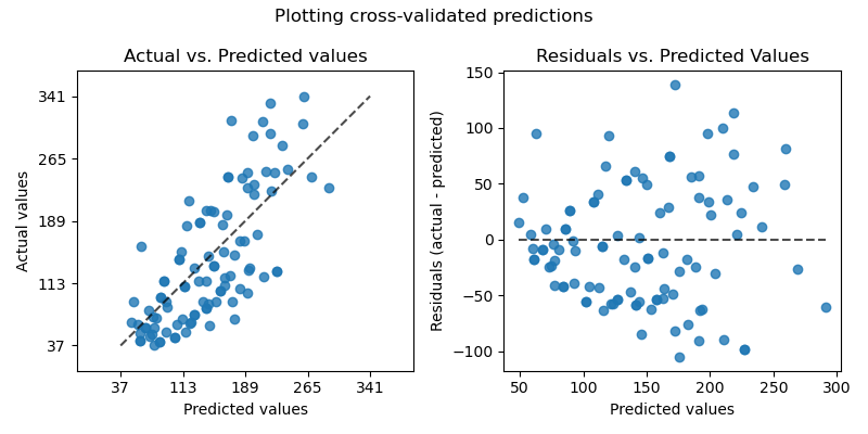
import sklearn.datasets
from sklearn.model_selection import cross_val_predict
import sklearn.linear_model
import matplotlib.pyplot as plt


lr = linear_model.LinearRegression()
boston = datasets.load_boston()
y = boston.target


# cross_val_predict returns an array of the same size as `y` where each entry
# is a prediction obtained by cross validation:
predicted = cross_val_predict(lr, boston.data, y, cv=10)


fig, ax = plt.subplots()
ax.scatter(y, predicted, edgecolors=(0, 0, 0))
ax.plot([y.min(), y.max()], [y.min(), y.max()], 'k--', lw=4)
ax.set_xlabel('Measured')
ax.set_ylabel('Predicted')
plt.show()